Steven ‘The Butcher’ Soderbergh Part 4 – 2001: A Space Odyssey
 Welcome to the fourth and final part of a series on Steven ‘The Butcher’ Soderbergh, wherein I take a look at Steven Soderbergh‘s online video releases. Throughout these features I will not only look at the way in which these films do, or do not, work but also try to understand Soderbergh’s possible motivations.
As with his re-cut of Heaven’s Gate, Steven Soderbergh accompanies his edited version of Stanley Kubrick’s 2001: A Space Odyssey with a brief explanation of his motivations. There are more words this time, but there’s not much new in the thoughts, with Soderbergh mainly using the space to paraphrase his justification for the Heaven’s Gate alterations.
But he does use the post to make a few interesting points about Kubrick, digital filmmaking and digital releases, including the following statement, which I think is well worth discussing before we move onto the actual film.
I’ve seen every conceivable kind of film print of 2001, from 16mm flat to 35mm internegative to a cherry camera negative 70mm in the screening room at Warner Bros., and I’m telling you, none of them look as good as a bluray played on an Pioneer elite plasma kuro monitor. And while you’re cleaning up your spit take over that sentence, let me also say I believe SK would have embraced the current crop of digital cameras, because from a visual standpoint, he was obsessed with two things: absolute fidelity to reality-based light sources, and image stabilization.
Regarding the former, the increased sensitivity without resolution loss allows us to really capture the world as it is, and regarding the latter, post-2001 SK generally shot matte perf film (normally reserved for effects shots, because of its added steadiness) all day, every day, something which digital capture makes moot.
Pile on things like never being distracted by weaving, splices, dirt, scratches, bad lab matches during changeovers, changeovers themselves, bad framing and focus exacerbated by projector vibration, and you can see why I think he might dig digital.
I think so too. And there was certainly no spit take from me when I read that thought. In fact, I think I may have punched the air instead.
There’s a prevailing attitude amongst a certain group of cinephiles that film – whether that’s 35mm or 70mm, or even 16mm – is the ultimate format for cinema, and that digital is a sad, but somewhat inevitable compromise. Soderbergh has pushed back against this attitude for some time, embracing digital filmmaking and exploring new ways to use it in the making of his films, and now television too.
The above quote highlights several key facts about digital filmmaking, and by attempting to imagine what Kubrick would think about these developments, Soderbergh does a great job of electrifying the debate.
He also links the arguments for digital cinematography and for digital projection, noting the greater possibility this conjunction offers for fidelity between input and output. This is a continuation of the argument for digital over analogue in many other fields, outside of cinema: zero quality loss or interference from external forces.
The positives that Soderbergh attributes to digital are provable, empirical evidence of digital’s superiority in certain respects and also, I happily believe, things that Kubrick would have relished about digital formats, being, as he was, so meticulous and concerned with imperfections.
Also speaking about Kubrick’s possible feelings towards modern cinematic technology, including higher frame rates and 3D, Douglas Trumbull said the following in 2013,
I think if he had lived, he would have loved this stuff, he would have loved what I’m doing now. He was all about extreme quality, image quality, depth, and color saturation — everything to make it look as good as it possibly could.
Following his opening discussion about digital and Kubrick, Soderbergh then goes on to have a little rant about an imperfection in the Blu-ray release of 2001: A Space Odyssey. importantly, though, this particular problem was the result of human error, the one thing that will always stand in the way of binary perfection.
In re-cutting Kubrick’s 2001: A Space Odyssey, Soderbergh has once more taken a film he loves and shorn it ruthlessly. Here the running time is down from 141 minutes – already cut by Kubrick himself from the premiere’s running time of 158 minutes – to just 100.
To do this, Soderbergh has very slightly trimmed some areas, and in others, he has completely excised vast chunks.
The scenes featuring Heywood Floyd following his Pan Am flight are almost entirely gone, with just a few essential moments kept in. There’s no call to his daughter, no discussion of the monolith, no mention of the epidemic story and nothing about US and Soviet relations.
Watching the film with these parts removed provoked some ideas about they might actually be considered superfluous. The epidemic, after all, is actually just a cover story that very quickly serves its purpose, and the rest is essentially exposition that’s not necessary to follow the plot.
Also, by holding back on certain pieces of information, Soderbergh makes some of the later scenes more surprising, turning them into narrative twists that dramatically energise the film. You could probably make a guess at the true nature of the mission, but in Soderbergh’s version, the first confirmation comes in the message when HAL is shut down.
This is also when the possibility of alien life gets its first mention. Without any kind of foreshadowing – beyond the appearance of the monolith, I suppose – this would be a very exciting, sharp turn for an audience to experience.
Another interesting excision comes in Soderbergh’s decision to remove the dialogue from Bowman and Poole planning to turn HAL off, and the scene instead plays in silence. Again, this leads to a dramatic twist when HAL himself later reveals what was being discussed, and how he actually understood it all.
Better still, the scene becomes somewhat chilling in its silent version. The audience will surely know that something bad is going to happen, but not what. Overall, Soderbergh’s 2001 is an interesting experiment, but here, in this scene, I think he actually improves upon the original.
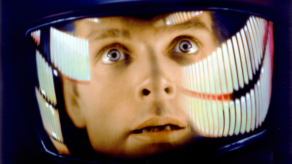
This new version was not just created through subtraction, as Soderbergh has also inserted shots into new places. The most significant of these is the dispersal of close-ups of HAL – essentially a robotic eye filling the screen – throughout the film. Soderbergh even starts his edit with this, beginning with a sequence in which he repeatedly intercuts the image of HAL with another of a human eye.
One symbolic intent seems clear, making a strong connection between man and technology and highlighting the film’s focus on evolution. Ultimately, the repeated shots of HAL build up to a real sense of foreboding and dread, and that things aren’t going to end well.
Soderbergh ends the film with the same shot of the Star Child from Kubrick’s cut, but this time it’s mixed with inserts of HAL. He appears to be suggesting an even stronger focus on one particular reading of the film, in which HAL, or machines in general, are identified as the next stage of out evolution.
Soderbergh’s finale makes a connection that wasn’t already there, combining an idea of the Star Child as an evolutionary leap for humanity with HAL’s representation of advanced artificial intelligence.
Soderbergh even cuts to himHALduring the Dawn of Man sequence, making him very much the central character in the film even as he remains the key antagonist.
Maybe Soderbergh was inspired by HAL’s popularity to refocus the film on the character who has become the ‘real star’ in many people’s minds.
The new 2001 is essentially new story that begins and ends with HAL, and which is simpler than the original in a number of ways, somewhat more straightforward and easier to understand. There are, of course, losses incurred – not least in the film’s complexity, or its weave of interlinked subtexts – but I’m sure Soderbergh was in no way attempting to supplant the original.
Instead, this 2001 is something new, an experiment into what a film might become when edited with a different agenda. Like the rest of his ‘Butcher’s Cuts,’ this film is a peek inside Soderbergh’s head, and a welcome chance to take a look at his workings out.
I’m not sure I will necessarily return to Soderbergh’s cut of 2001: A Space Odyssey in quite the same way as I will with his cut of Heaven’s Gate, but I will certainly take another look at it when I’m thinking about Soderbergh.
When 2001: A Space Odyssey is on mu mind, however, I’ll still reach for the Warner Brothers Blu-ray, or maybe get lucky with a 4K projection in a well designed cinema.
Unlike previous Soderbergh video experiments, his cut of 2001: A Space Odyssey is sadly no longer available to watch online, with the blog post now ending with the following unfortunate statement,
AT THE REQUEST OF WARNER BROS. AND THE STANLEY KUBRICK ESTATE, THE RETURN OF W. DE RIJK HAS BEEN REMOVED FROM THIS SITE.


